- CCM Design Insights
- Posts
- Presentation Design: Tips for designing better presentations
Presentation Design: Tips for designing better presentations
Summary: Find out which types of presentation are best to use, finding a balance between visual appeal and usability to improve results.
Whether presenting updates at a board meeting, documenting information internally, or sharing a new strategic proposal—presentation design is important
And we're not just saying that because we're a design studio. The truth is that a user-centered presentation has the power to transform the way the public or user sees your institution and your work for the better.
Something can be very nice, but if it doesn't communicate its message well, it doesn't matter how nice it is. Keep in mind the balance between looks and usability; it will increase your results.
From readability to the effective presentation of information, I'll share some of the basic principles of presentation design, and my tips for designing better presentations.
Types of presentation
Did you know that there are different ways of creating a presentation? When we talk about designing a presentation, many people think that all they have to do is open PowerPoint, choose a template, add a few photos and titles, and voilà, the presentation is ready.
And that's where the big problem lies: this is not always, almost never, the best way to create your presentation.
Before starting the creation process, consider your presentation as a whole: Where will it be presented? Who will see it? Will it be sent by email or presented at a meeting?
If you're making a presentation for a conference, for example, consider that the slides will be viewed on a large screen. Here at CCM Design, we call these “Support Presentations”.
Now, if this presentation will be sent by email, consider that it will be viewed on a computer, mobile, or tablet. As well as considering the screen size, the content needs to be self-contained. It needs to make sense on its own without any further explanation. This is what we call a “Standalone Presentation”. It works much similar to a report.
Remember: presentation design always depends on the context.
Standalone presentation
Have you ever seen those slides that are filled with so much text and background noise that you don't even want to bother reading them?
A good-looking presentation is a great starting point, but the user has to be able to quickly read the slide and digest the content easily.
Standalone presentations are those in which you are not there to make the presentation to your audience. Instead, the presentation is the only medium to communicate the whole message.
Unlike support presentations, standalone presentations will be read on a computer or iPad so that they can have a bit more text, but that doesn't mean overdoing it. It is acceptable to have full paragraphs of text and sometimes even full slides of text. This is fine because we can assume the audience will be directing their full attention to the presentation itself. General writing techniques still apply here, like being clear and concise.
If you're writing paragraphs, limit the number of words to 12 per line to improve readability, and make sure there is enough margin around your text so that it doesn't look cramped.
Create a coherent storyline, i.e., summarize the main idea of each slide in a single sentence, or at most a short paragraph, so that each piece of content is self-contained.
Other practical tips to increase the readability and effectiveness of your standalone presentation:
Separate into sections, preferably using "covers" or intertitles;
Avoid too many effects and animations.
What you shouldn't do in your standalone presentation:
1 - Avoid distributing the presentation in a PPT file, as it doesn't guarantee consistent visualization between computers. This inconsistency can cause typography issues, breaking the consistency (and sometimes the meaning) of your slides. Instead, use PDF, which guarantees file consistency and opens on any device.
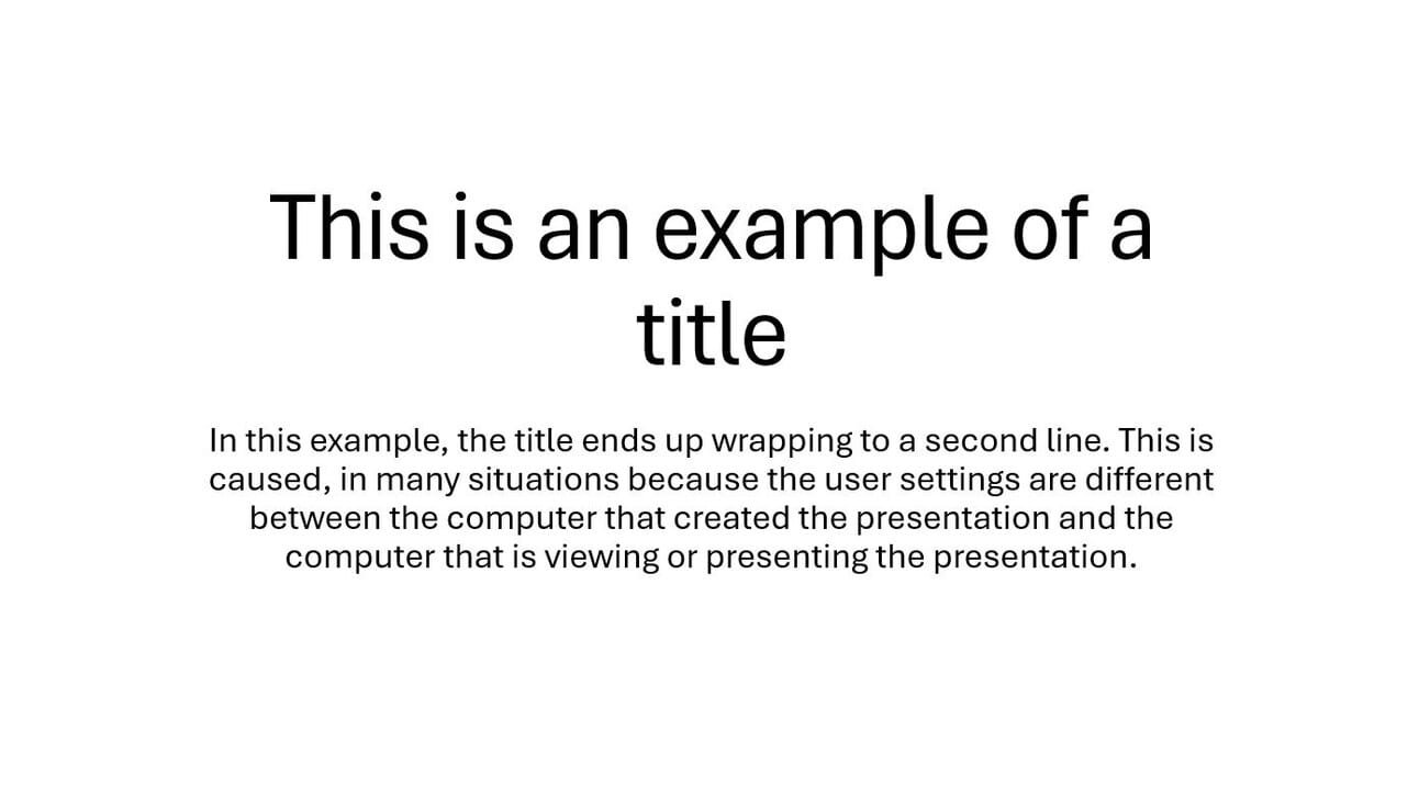

Look at how the typography optimizes readability and accessibility, ensuring an excellent user experience.
2 - Avoid huge/heavy files (videos, photos, infographics). Remember that the presentation needs to be sent over the internet and will be accessed on different devices. The smaller your file, the better.
Support Presentation
In Support presentations, a good layout and structure will be the best forms of non-verbal language and effective communication. For that, keep your slides breathable, digestible, and scannable.
You shouldn’t use a lot of text—or even no text at all (depending on your proposal). After all, you don't want the audience to stop in the middle of the presentation to read the text. The "text" will be the presenter's speech.
This is why texts and images don't have to make sense on their own, but they do have to support what is being said on stage.
Even so, it's important to keep visual consistency throughout your presentation.
A TED example of a Support presentation
Let's take as an example this support presentation developed here at CCM Design for the Co-Founder and Chief Research and Development Officer of the GovLab at NYU, Stefaan Verhulst, for a presentation at TEDxMidAtlantic on how to use data to improve our lives.
See how the slides don't exist in a silo. Even though each one deals with a different subject, and even though they use little text or images, they maintain a consistent visual language.
The background and slide frames create a repetition pattern across your slide deck. Whether solid color, filled with shapes or photos, or event patterns, the backgrounds maintain the identity and visual cohesion across the slides.
You may notice that some slides don't convey the whole information by themselves, for example:

What will the relationship between Rihana, Kim Kardashian, and Sherlock Holmes be with data? Well, we have no idea. That's why supporting presentations need context; they need a presenter. Without it, the information will be lost.
Conclusion
Here's a quick recap of our presentation design tips and the top takeaways to remember when you're designing your next presentation:
Keep in mind the balance between the appearance and usability of your presentation.
When writing standalone presentations, be clear and concise; avoid large files and save them as PDFs.
When creating supporting presentations, create visual consistency across all slides.
Good design is only one part of the process! The content and the presentation are equally important.
Remember: the design of the presentation always depends on the context.
To make the most of all these tips and improve the results of your presentation, talk to a design professional to create your presentation. They will help you develop a user-friendly presentation. Maybe we can help.